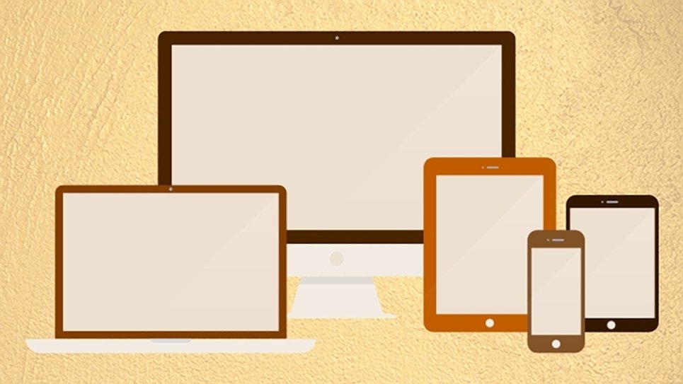
Responsive web design is an approach to web design that changes a webpage’s layout in response to the width of the screen. This enables users of smartphones, tablets, laptop, and desktops to all get optimal viewing and interactions on your website.
Why Responsive Web Design?
Without responsive web design, larger screens may present pages narrowly with lots of extra space around the content, or column width may increase so much that your text becomes very hard to read. Mobile devices will shrink the whole webpage down to fit on the smaller screens. The user will have to zoom in to read your content and zoom out to find other places on the page, like navigation. This makes for a more time-consuming and often frustrating experience for your site’s users.
With responsive web design, a single website serves the needs of each screen width, because the design changes based on the width of the screen. No more creating a website plus a mobile site, or creating a website plus an iPhone app, plus an Android app, plus a… One set of code makes your site easier to maintain.
Responsive web design also means that when new devices with different screen widths come out in the future, your website will be ready.
Last, but certainly not least, Google now gives preference to responsive sites when ranking their search results, because the experience for mobile users is so much better than a traditional non-responsive site.
How Does it Work?
With responsive web design, standard desktop and laptop screens will have the familiar two- or three-column page design. Larger screens and Internet-connected TVs, with their wider screens, may have four or more columns for content. Tablets will have one or columns, and smartphones will have one. This way, columns are not too wide or two narrow. Text, images, and spacing is adjusted for that “just right” experience on all devices.
While columns are arranged in side-by-side columns on larger screens, they set in a vertical line, one after another, or “linearized,” on as screens go narrower. With this site, for example, the header displays first, followed by the main content area, the sidebar and the footers. This way, users of mobile devices can read and navigate your site quickly and more easily.
Another change that happens on smaller screens, navigation is given a small footprint. Commonly, a three-line icon, or “hamburger menu,” appears at the top instead of the page instead of the full menu of larger screens.
Responsive images and videos are part of responsive web design. Scaling images and videos enables them work within the responsive web page as a whole without exceeding the boundaries of the page design on smaller screens.
See Responsive Web Design in Action!
To see how it works, you may slowly make the browser narrower and wider. You should see the layout automatically adjust to fit the new width of the browser for better reading and enjoyment of the content, even down to the width of a smartphone. Check out our responsive web design portfolio.